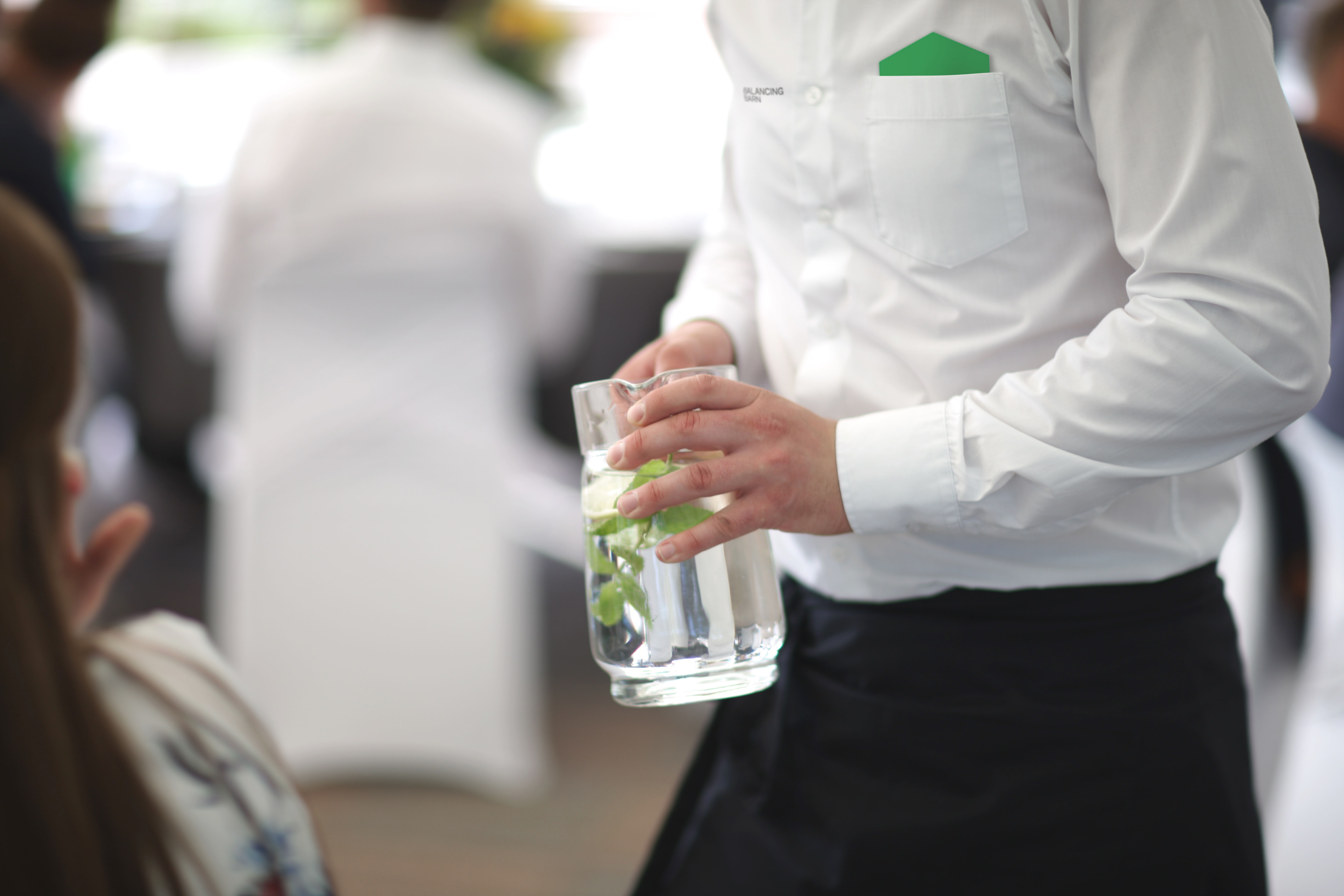
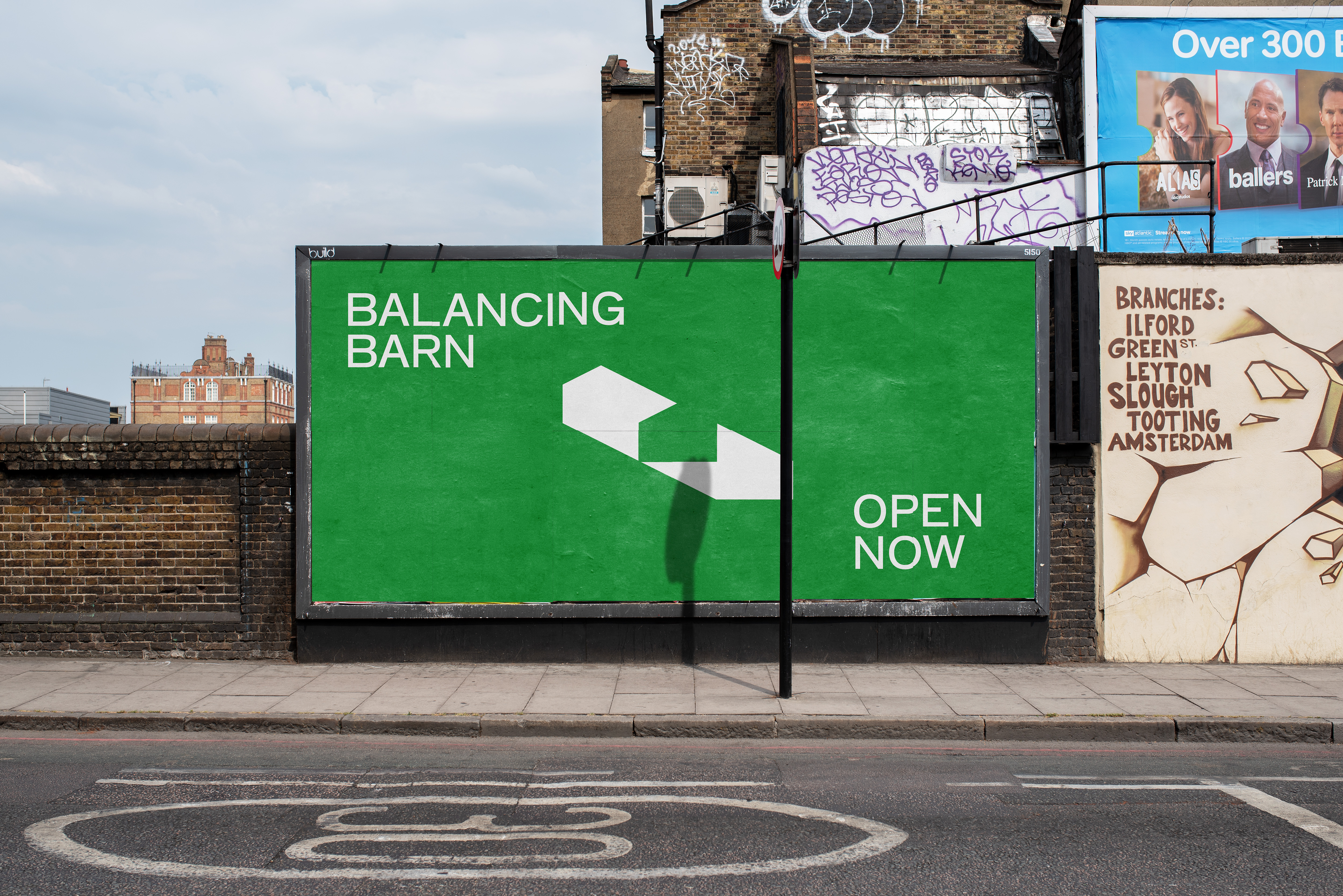
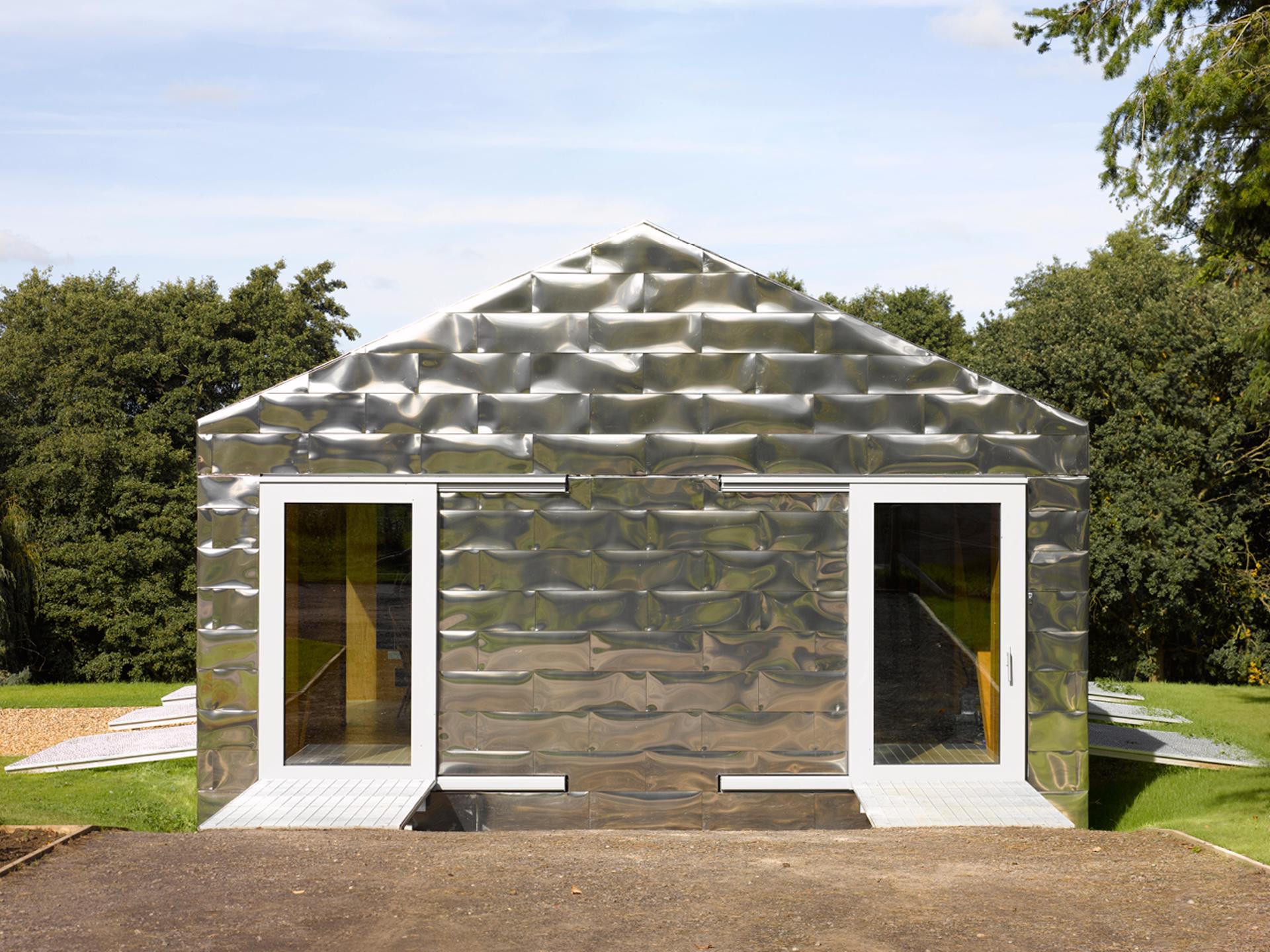
Balancing Barn
Restaurant Identity
2022
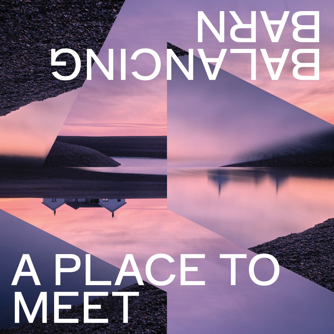
A restaurant for nature, in nature. Located in rural Suffolk, Balancing Barn represents new ideas coming into collision with the timeless notion of the English Countryside.
Perspective, reflection and contrast form the key themes of the identity which are conveyed through type, image, colour and the restaurant’s logo mark.
Perspective, reflection and contrast form the key themes of the identity which are conveyed through type, image, colour and the restaurant’s logo mark.
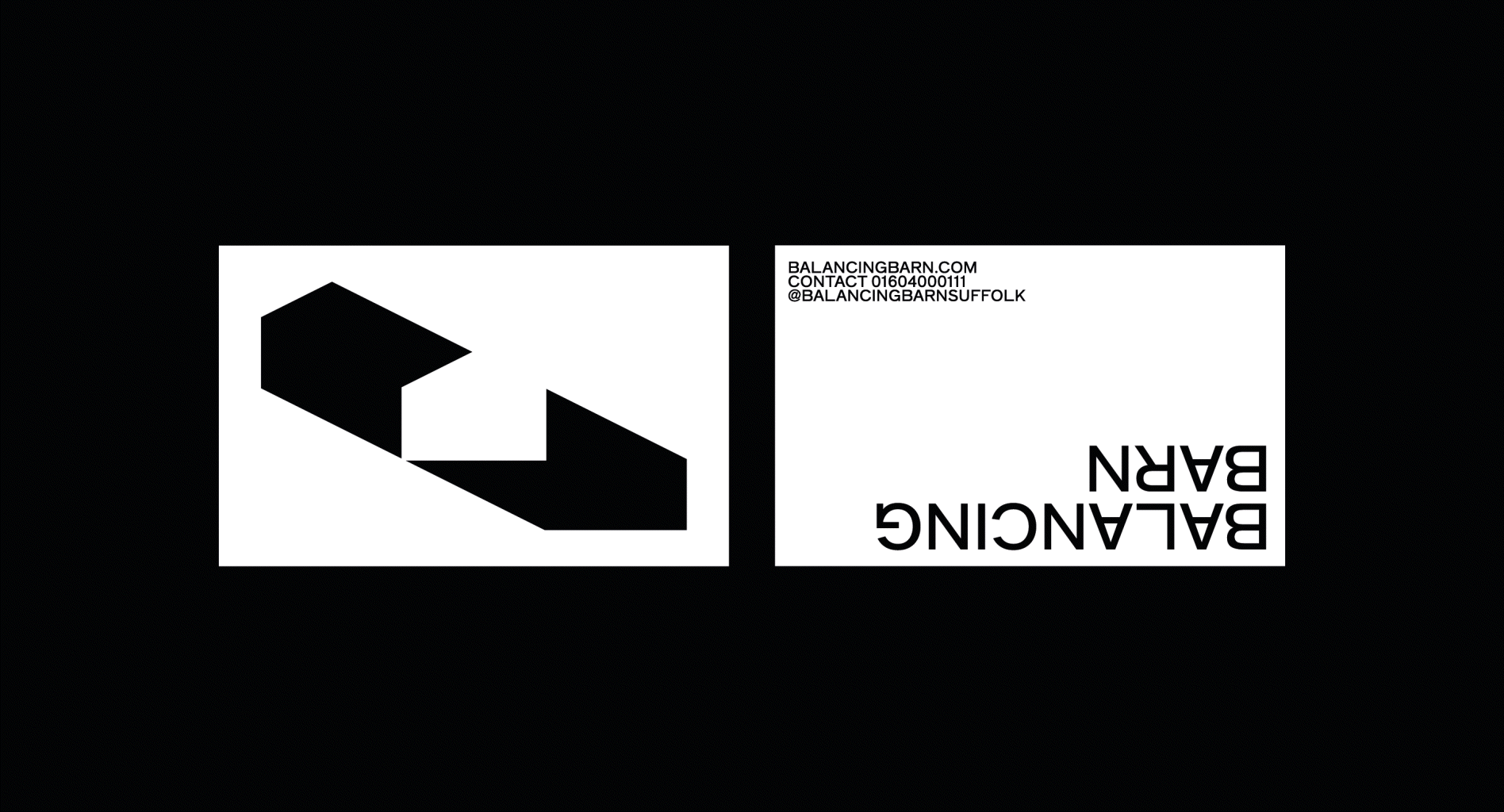
The Balancing Barn logo mark is a symbol of perspective. As the logo revolves, the barn switches perspective from the ‘land’ side to the ‘sky’ side, the upper level to the lower. The word mark alternatively imitates the structure of the barn and it’s 50% cantilever.


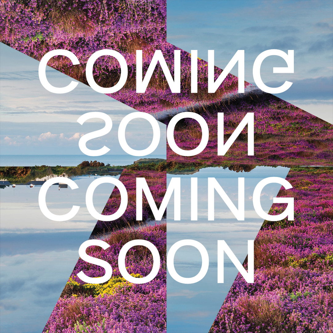


A pattern constructed of 50:50 black and white squares have been used in random assortments to address themes of reflection. This template has been extended for image treatment and combined with typography that further incorporates the notion of reflection.