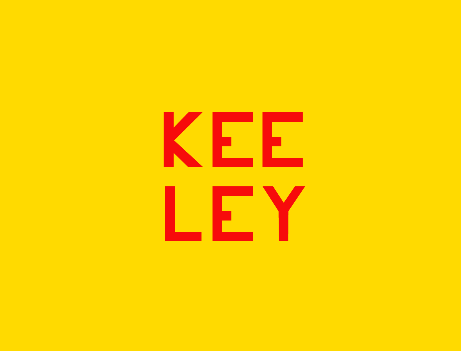
KEELEY
Typeface
2023
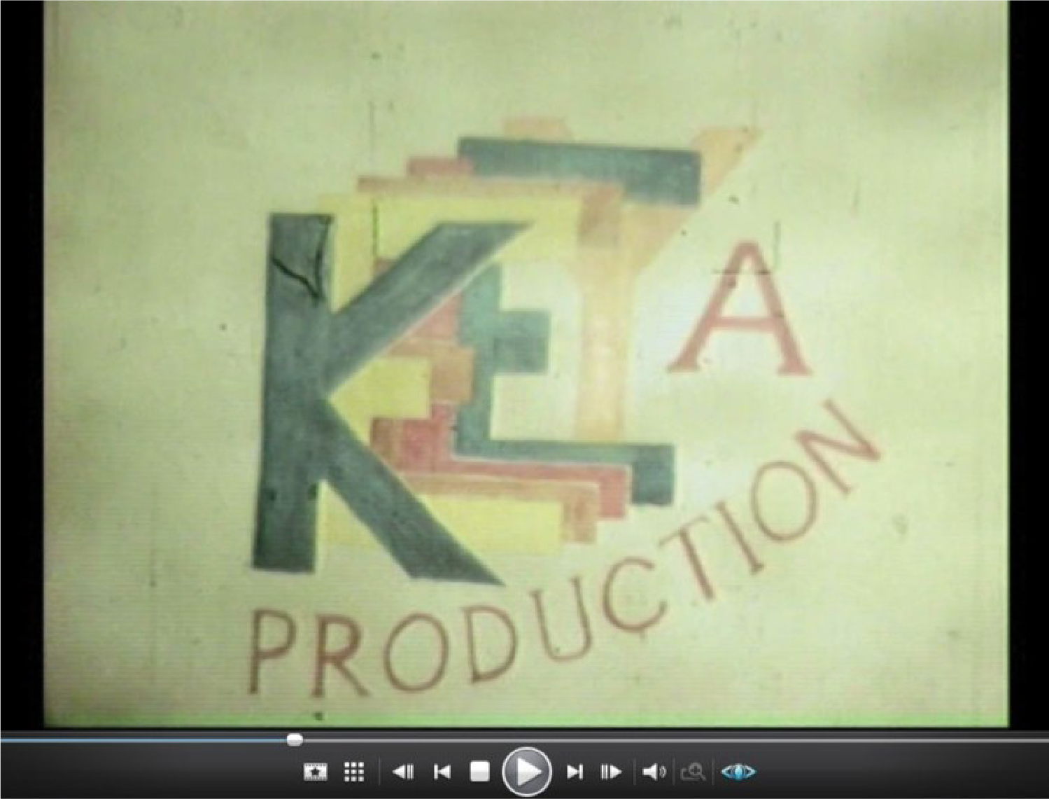
A typeface based off of a logo made by my grandfather in the 1960's for a short home film.
I've expanded the typeface into full upper and lowercase, taking cues from popular sans-serifs of the time and the odd details in the logo itself such as the short, low bar in the E and sharp angles of the K.
I've expanded the typeface into full upper and lowercase, taking cues from popular sans-serifs of the time and the odd details in the logo itself such as the short, low bar in the E and sharp angles of the K.
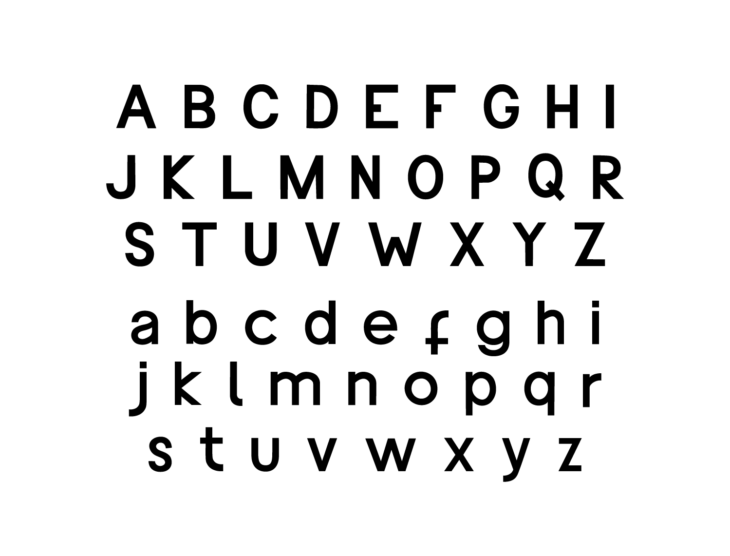
I believe the original letters to have been cut out and coloured in, and in the case of the E and K, flipped horizontally (intentionally or unknowingly), and as such have carried this approach through in letters such as the lowercase F and T being mirrored versions of the same shape.


By no means is this a perfect alphabet, it hasn't been endlessly tweaked and perfected; conversely, I intend that the hand of the designer remain visible to the viewer, as it is in the original logo.